October 18, 2016
King Dork Approximately the Cover that Might Have Been
(This was also posted on the Sounds Radical blog.)
Frank Kozik is one of the greatest poster artists in the history of rock and roll. His work revolutionized the "rock concert" poster in a fundamental way, and whether you realize it or not, if you've been a rock and roll person over the past twenty-five years, you've seen his stuff, especially perhaps in San Francisco, where he moved (from Austin) in the early '90s. Even if you didn't know anything about the man himself, one of "those" posters meant the show it advertised was real and significant; these images were an integral part of the show-going experience (and are often the thing I remember most about shows I've been to when I think back) Of course, my dumb little band never did the kind of show that would have warranted that sort of treatment or attention: our poster style was, find a picture from a magazine, photocopy it with added text, and tape it to a pole.
But in the pretend rock star parallel fantasy world that lived in my mind alongside the actual one, every show had a Kozik poster, because of course it did.
So I was indescribably excited, overcome with emotion in fact, when I learned that Krista, my editor at Random House, and Angela, the book designer, had arranged for Frank Kozik to do the cover of my new book King Dork Approximately. I wanted to kiss them. It was such a perfect idea. It was amazing that he agreed to do it. Also, it was the realization of a lifelong dream.
Plus it was just great art. He'd read the manuscript and come up with a terrific King Dork-ization of the Judas Priest Screaming for Vengeance eagle (which plays a big role in the book.) The original sketch looked like this:
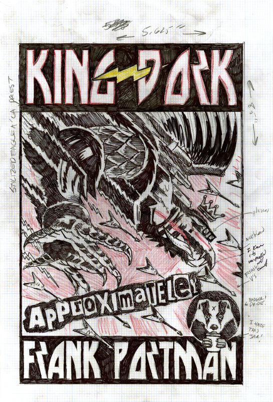
"Well, Doctor," I said to the face in the mirror, "they can't take this away from you." Except, they could.
It's a long, complicated story, but publishing a book is never a simple matter. There are many considerations, and hundreds of people involved in considering them. Folks who hadn't been through the same rock and roll wringer that I'd been through, for whom this artwork was nice but not, perhaps, the realization of a life-long dream, wondered whether people would "get it." We looked at other options, as you do. And in the end, due to circumstances beyond our control, the cover was scrapped, new approaches investigated, release dates delayed, tears cried, teeth gnashed -- the standard procedure in every human endeavor. The hardcover book was published with the yellow cover you know, and life went on.
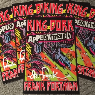
Well, in publishing, a paperback release is like a second chance. And as you may have been able to tell, I've put a whole lot of energy into making this particular second chance as special and second chance-y as possible, with new cover art, a new album, singles, videos, shows, T shirts, lunchboxes, cookies, etc. etc. So when Chris of Sounds Rad and I started to discuss ways to make our rock and roll KDA specialty packages as cool as possible (and remotely signable) we decided to reproduce the original cover, book sized, as an insert for me to sign instead of the usual bookplate. Pretty cool. Welcome back, lifelong dream.